covid-stats
Hospital Mortality in England
Background
I undertook this piece of analysis to investigate the reasons for an apparent rise in hospital mortality rates within England. The same can also be done for the UK as a whole but for this exercise, I focused on the data supplied by NHS England.
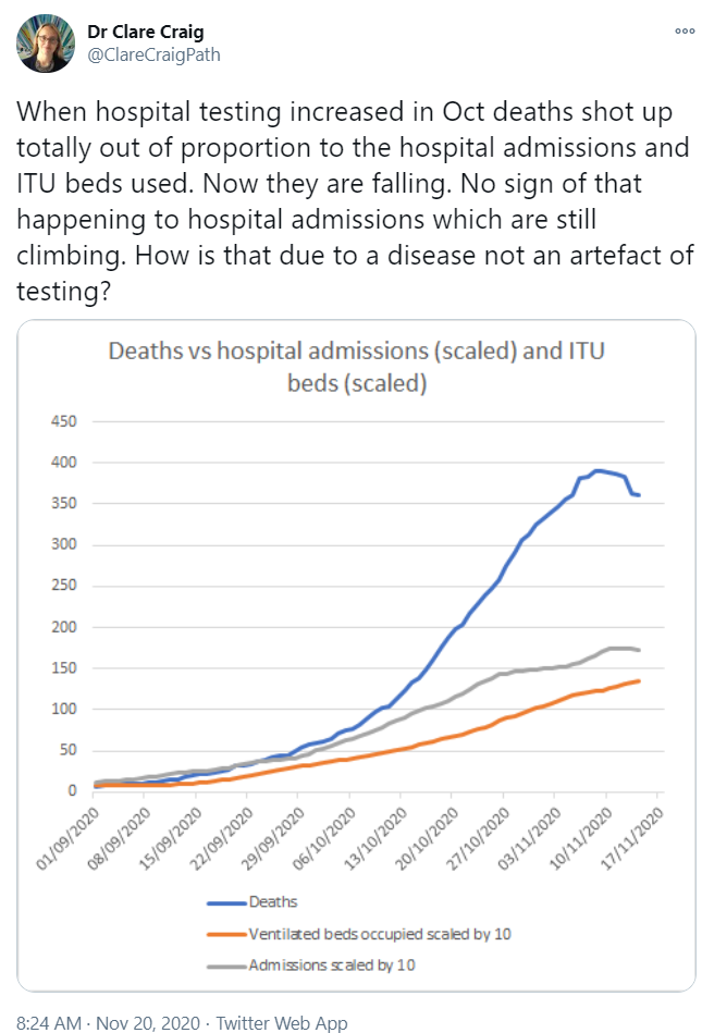
The catalyst for my analysis was a claim on Twitter that deaths were rising out of proportion to hospital admissions, asking how it could be due to the disease and not an artefact of testing.
What is this Data?
My first step was to determine how the graph had been created and confirm the source of the data.
Based on the number of daily admissions, deaths and MV beds it was apparent that the data came from the PHE dashboard.
Daily deaths - 7 day average slightly under 400:
Hospital admissions - 7 day average around 750, thus 75 when divided by 10.
MV beds - 7 day average around 1400, thus 140 when divided by 10.
Reproducing the Original Graph
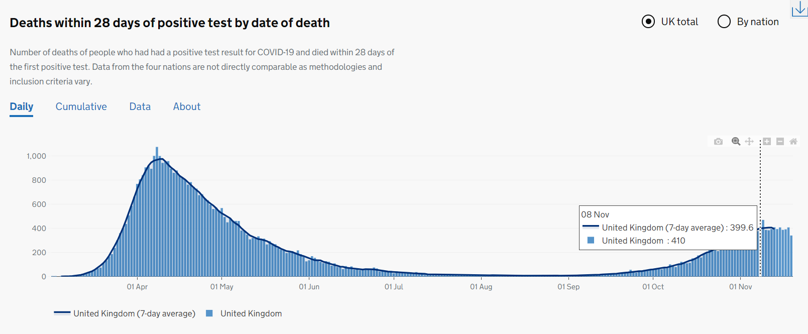
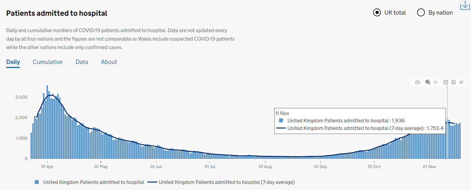
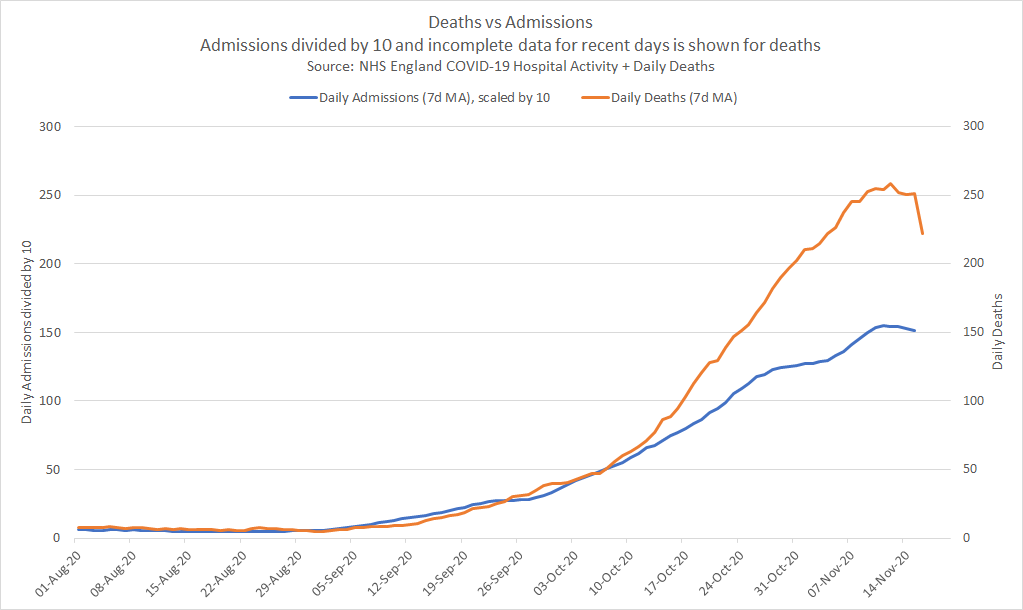
Since this analysis is focused primarily on hospital admissions and daily deaths, I opted to use the daily COVID-19 data published by NHS England:
I calculated centralised 7 day moving averages for daily admissions and daily deaths in Excel, producing the graph below which can be easily compared to the original Twitter post. The graph using NHS England data shows the same trends as the original Twitter post, although the actual numbers are slightly lower because it is specific to hospitals in England. The trends are essentially the same though!
Alternative Perspective
Having confirmed that the NHS England data showed the same trends as the Twitter post, I began my own investigation.
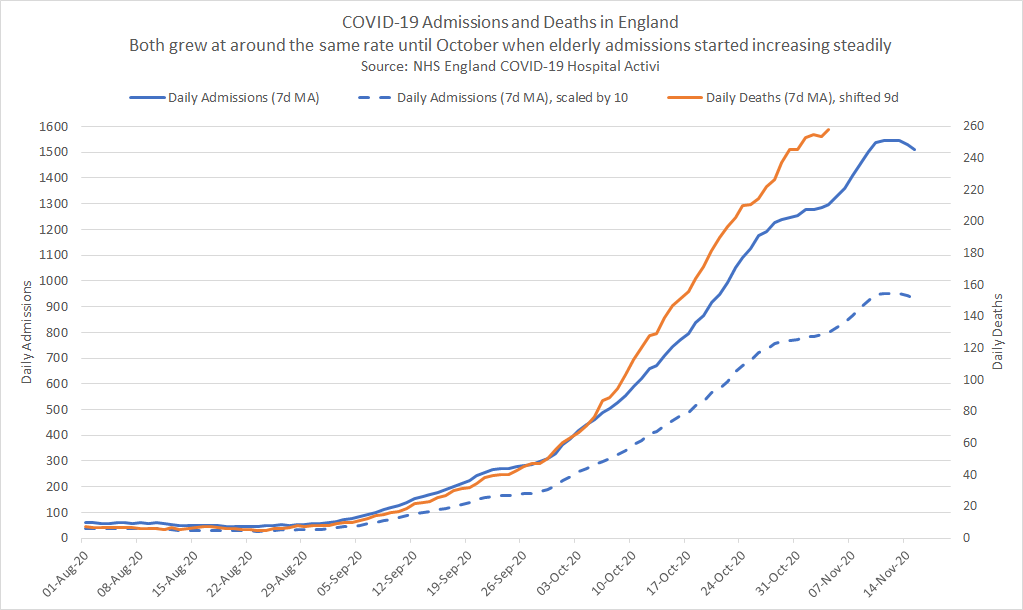
The first step was to make a few “improvements” to the original graph:
- The latest 3-4 days of daily deaths figures (based on “date of death”) must always be excluded because they are always incomplete.
- When contrasting admissions and deaths it is helpful to use comparable scales. The original division by 10 is somewhat arbitrary.
- Shifting daily deaths leftwards aligns them with the corresponding daily admissions. I used 9 days, based on the latest ICNARC report but 10 days would also work well.
My revised graph clearly shows how the number of daily deaths started to increase more rapidly than daily admissions from early October onwards. The effect of scaling can also be seen in the two admissions curves, where dividing by 10 is somewhat arbitrary.
Possible Explanations?
The focus of this analysis is to determine why daily deaths have been rising faster than daily hospital admissions during October.
- Is it an artefact of testing as suggested in the original Twitter post?
- … or was it simply due to a change in the age groups being admitted to hospital during this period?
Demographics / Age Groups
I decided to look closely at demographics and specifically the age groups of people being admitted to hospital.
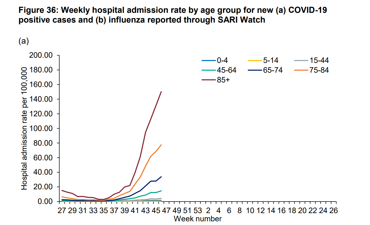
For this exercise, I used the latest National flu and COVID-19 surveillance report published by PHE on 9 November 2020 (week 47).
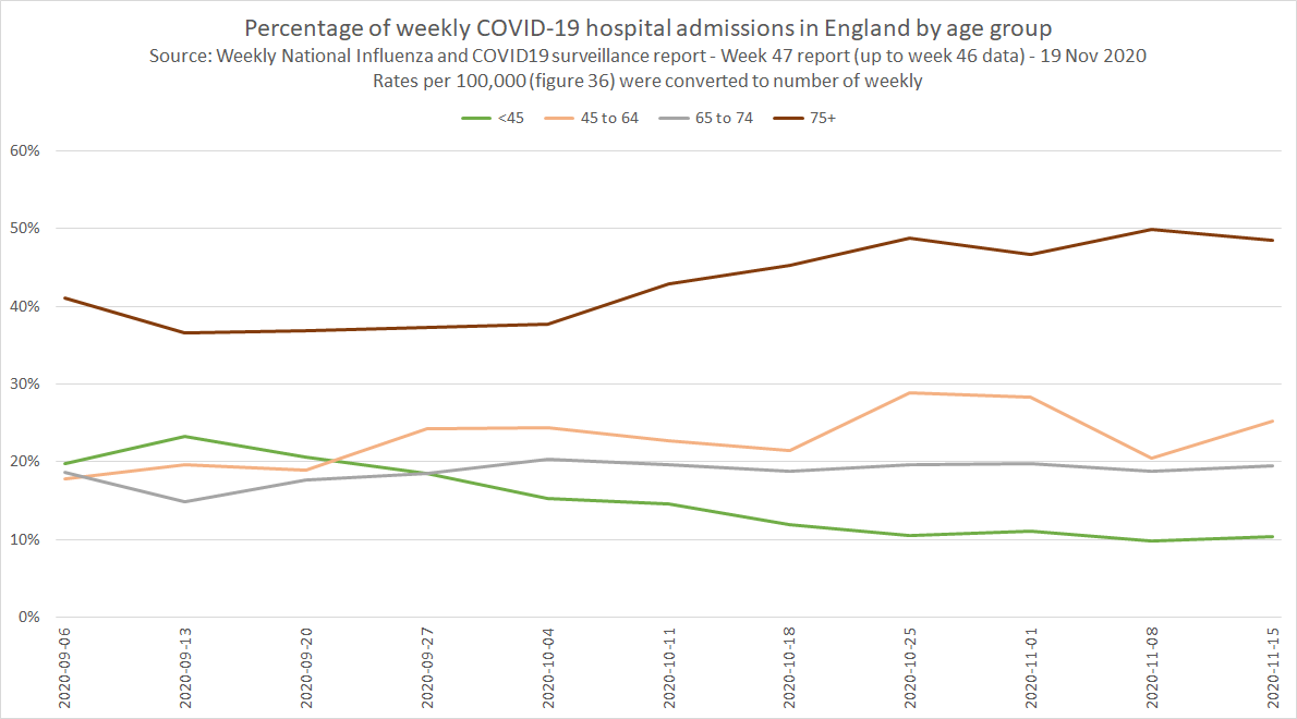
Figure 36a shows the weekly hospital admission rates for COVID-19 cases by age group. I used this exact same data (available in Excel) for my data analysis.
Analysing the PHE data
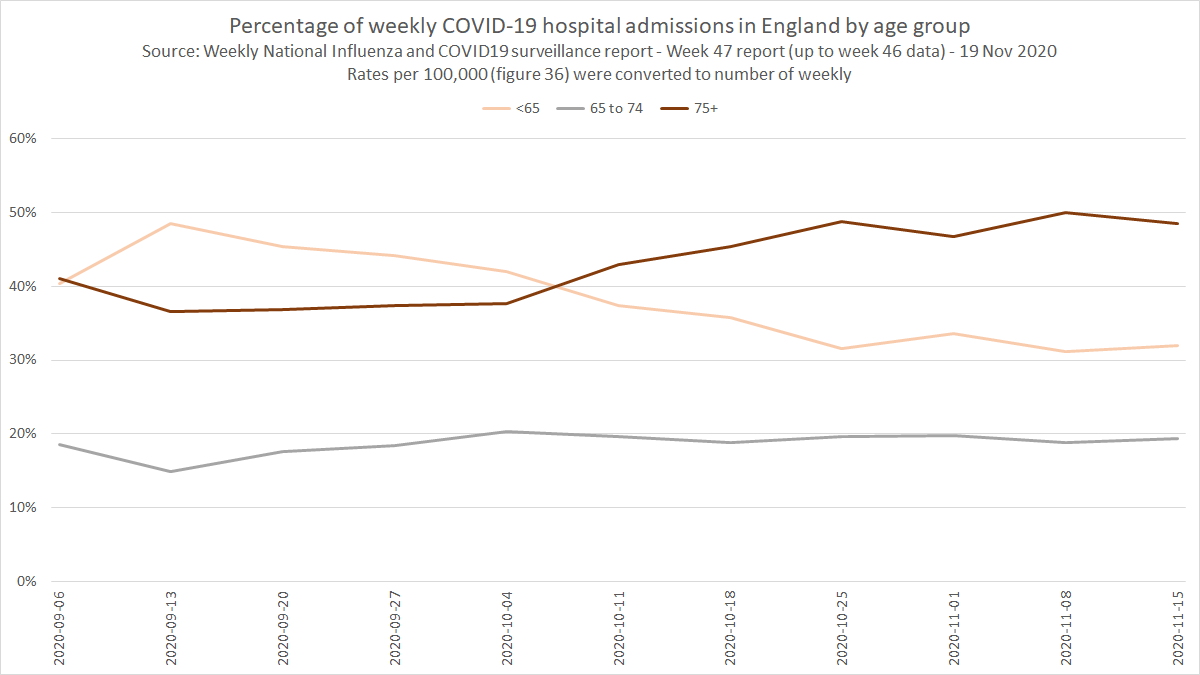
Utilising the latest population data from the Office for National Statistics, I converted the PHE weekly rates (admissions per 100,000) to the number of weekly admissions for each age group.
What is very clear from the graph below is the changes in demographics (specifically age groups) from mid-September onwards:
- The % of admissions under the age of 65 decreased from ~48% to ~31%
- The % of admissions over the age of 75 increased from ~37% to ~50%
- At the beginning of October there was a clear reversal of the under 65 and over 75 age groups
A further breakdown of the under 65 age group shows that the biggest decrease was in patients under the age of 45, shown in green.
Higher Mortality in Elderly Patients
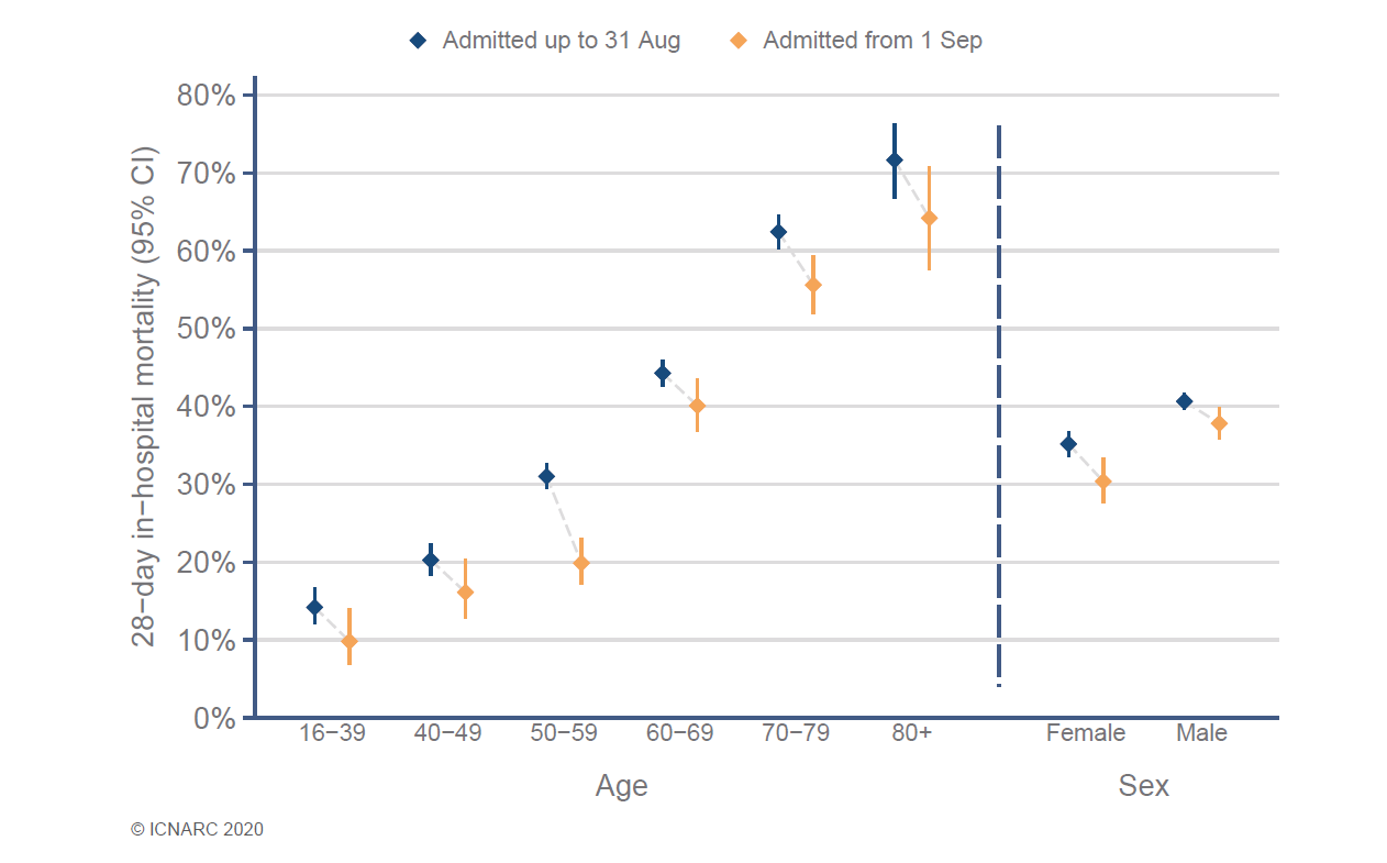
We all know that higher mortality rates are seen in the elderly COVID-19 patients and this is especially clear in the weekly ICNARC reports, specific to COVID-19 patients in intensive care.
It can also be noted that recent mortality rates (orange) in ICU are lower than earlier in the year (blue) but they have been steadily increasing over the past couple of months. Mortality rates have improved since the spring time but are still very high in ICU.
So is the rising mortality rate (deaths vs admissions) simply due to the rise in elderly admissions? Can we prove this in some way?
Proof of the Pudding…
Can we estimate the relative mortality rates for the weekly hospital admissions? How would these estimates then compare to the actual reality?
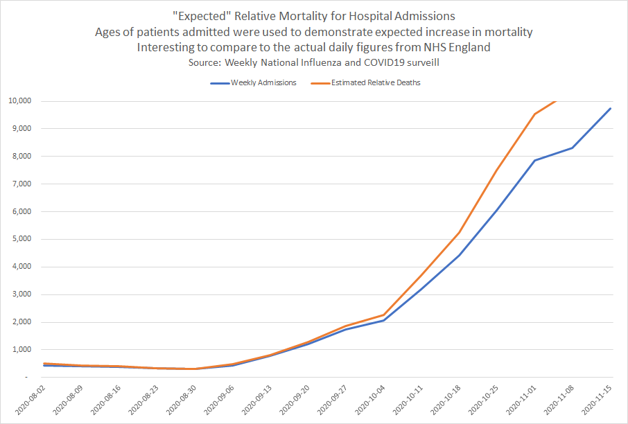
Well, I applied the relative mortality rates from ICNARC report to the weekly admissions for each age group from PHE, thus estimating the number of weekly deaths relative to admissions.
The resultant graph clearly shows how the “expected” number of weekly deaths would increase more rapidly than weekly admissions, especially throughout October.
The “expected” weekly mortality (see above) can now be compared to the daily reality (see below) of the NHS England data.
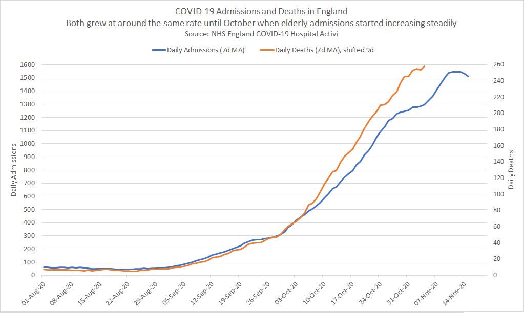
So, it is quite clear that the weekly estimates (PHE data) match the daily reality (NHS data) incredibly closely. The weekly estimates were simply calculated using the known mortality rate for different age groups.
Note: The final downtick in daily admissions is not visible in the weekly data due to the daily data being slightly more up-to-date.
Conclusions
It should be clear that the change in daily death rates is entirely explainable by a higher percentage of elderly admissions.
Admissions and deaths would not be expected to rise at similar rates when the age mix is changing.
The difference between the increase in daily admissions and daily deaths cannot be attributed to artefacts of testing!
Food for Thought…
The number of “expected” hospital deaths in relation to hospital admissions can be accurately predicted via a simple algorithm / model and statistics relating to ICU mortality rates. It’s of little surprise to me but I hope that I’ve demonstrated it clearly in this article.
Honest use of algorithms/models/statistics can be used to predict and explain real-world observable events, bringing together the theory and reality. Sadly… algorithms, models and statistics now seem to be the subject of ridicule for sections of society.
Who knew the power of logic and mathematics in an age when the opinion of Johnny on Facebook/Twitter/YouTube trumps experienced scientists, statisticians and experts? Don’t just jump to conclusions because it suits your agenda!
“All models are wrong, but some are useful” - hopefully I’ve demonstrated the potential for usefulness of models in this article.